Choosing the right blinds and wall color combination is a subtle art that can dramatically transform the ambiance of any room. Whether aiming for a serene retreat or a bold statement space, understanding how different tones, materials, and styles work together is key to creating a harmonious interior. This article delves into the nuances of pairing blinds with wall colors, offering inspiration and practical tips for various room styles, light conditions, and personal preferences. From the texture of bamboo shades to the impact of light on color perception, we’ll guide you through crafting a cohesive and aesthetically pleasing environment.
Contents
- 1 Key Takeaways
- 2 Harmonizing Blinds with Wall Colors
- 3 Choosing Blinds for Varied Room Styles
- 4 The Impact of Light and Space on Color Choices
- 5 Exploring Material and Color Samples
- 6 Final Touches: Complementing Furniture and Fixtures
- 7 Conclusion
- 8 Frequently Asked Questions
- 8.1 How do I match blinds with my wall color?
- 8.2 Should blinds match the floor or just complement it?
- 8.3 Can texture play a role in selecting blinds?
- 8.4 How do I choose blinds for an open plan area?
- 8.5 What’s the best way to test how blinds will look in my home?
- 8.6 How do I choose blinds for a room with saturated wall colors?
Key Takeaways
- Complementary tones and textures play a significant role in achieving a balanced look between blinds and wall colors, enhancing the overall feel of a room.
- The choice of blinds should be influenced by the room’s style, with color pairings like coffee tones with sky blue creating an eclectic, peaceful atmosphere, and saturated colors in flat design for a modern, bold look.
- Light and space considerations are crucial when selecting colors, with lighter hues maximizing the feel of small spaces and cohesive color schemes uniting open plan areas.
- Sampling different materials and colors is essential before making a final decision, as it allows for a better understanding of how blinds will interact with the room’s decor and lighting.
- Blinds should match the walls and complement key furniture pieces, flooring, and cabinetry, ultimately serving as a cohesive design element within the space.
Harmonizing Blinds with Wall Colors
Understanding Complementary Tones
Complementary colors sit opposite each other on the color wheel, creating a dynamic contrast that can bring vibrancy or balance to a room. Choosing the right complementary tones is crucial for achieving the desired ambiance. For instance, pairing a sunny citron with a muted purple can infuse a space with energy, while gold and warm lavender offer a more subdued elegance.
When selecting blinds, consider how they will interact with your wall colors. A coffee tone blind might harmonize with sky blue walls for an eclectic and peaceful vibe, or a goldenrod blind could complement dark blue walls for an artsy touch. The key is to balance saturation and brightness to enhance the room’s character without overwhelming it.
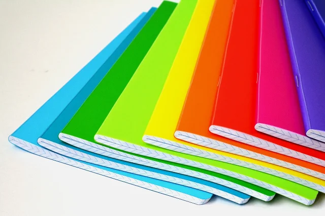
The texture and material of blinds also play a significant role in how colors are perceived. A wood tone like Jute Wheat can bridge the gap between browns and grays, adding warmth and a coastal farmhouse charm.
Remember, the goal is to create a cohesive look that reflects your personal style and the functional needs of the space. Experiment with different combinations to find the perfect match for your home.
The Role of Texture in Color Matching
Texture plays a pivotal role in the interplay between blinds and wall colors. Just as an artist layers colors on a canvas, an interior designer layers textures to create depth and intrigue. A rough, nubby texture can add warmth to a cool color scheme, while a sleek, smooth texture can bring a modern edge to warmer hues.
Texture and contrast are essential for creating a dynamic space. Consider the tactile experience as much as the visual when selecting blinds. For instance, a linen-textured blind can soften the appearance of a stark white wall, adding a touch of elegance and comfort.
When matching blinds to your wall color, think beyond the hue. The texture of the blind can complement or contrast with your wall’s finish to achieve the desired effect. Here’s a simple guide to help you decide:
- Rough textures like burlap or tweed pair well with matte or eggshell wall finishes.
- Smooth textures such as silk or satin are a match for glossy or semi-gloss paints.
- Natural textures from materials like bamboo or jute add an organic feel to any color palette.
The key is to choose a texture that will complement the overall style of the room, whether it’s a cozy farmhouse or a sleek modern loft.
Remember, the goal is not to match but to compliment. A well-chosen texture can bridge the gap between different wood tones and shades, creating a cohesive look that feels intentional and polished.
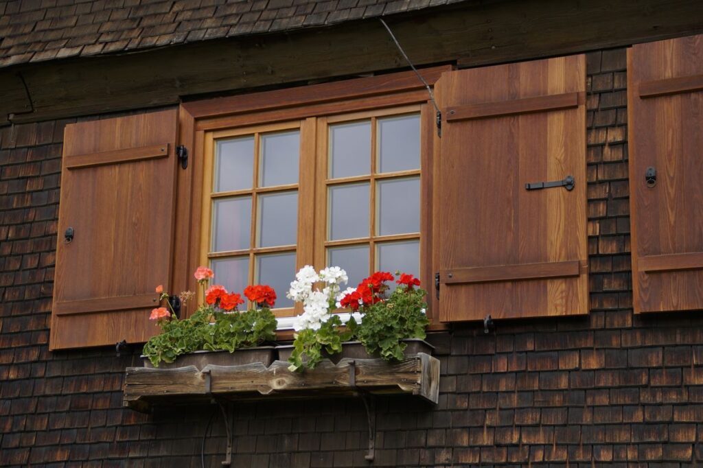
Incorporating Wood Tones and Shades

Wood tones bring a natural, grounding element to any room, and when paired with the right wall colors, they create a cohesive and inviting space. Choosing colors for wood shutters can be a delightful process, as options like white, black, gray, tan, and natural wood tones offer versatility. These shades can harmonize with a broad spectrum of wall colors, enhancing the room’s aesthetic.
Incorporating wood tones requires a balance between the warmth of the wood and the overall color scheme of the room. For a serene and earthy feel, consider sandy tones that add stability and warmth. A medium wood tone, such as Jute Wheat, can complement both browns and grays, fitting well with a coastal farmhouse style.
The texture of wood, whether in furniture or blinds, adds depth to a room. It’s not just about color; the feel of materials like bamboo shades or curly wool accents contributes significantly to the room’s design, offering a level of interest that balances out brighter elements.
When selecting wood tones, pay attention to the existing elements in the space. Driftwood, rocks, and tree trunks inspire brown notes that can be echoed in oak, walnut, maple, or sycamore furnishings. These natural inspirations can guide your color choices, ensuring a harmonious blend with the room’s palette.
Choosing Blinds for Varied Room Styles
Eclectic and Peaceful: Coffee Tones with Sky Blue
The serene blend of coffee tones with sky blue creates an ambiance that is both eclectic and peaceful. This unique combination evokes the comfort of a favorite coffee house or lounge, offering a soothing retreat from the outside world.
- Coffee tones provide a warm, earthy base.
- Sky blue adds a refreshing touch of calm.
- Brown shades enrich the palette, enhancing the overall coziness.
The key to this color harmony lies in the balance of warm and cool hues, crafting an inviting space that stimulates relaxation.
The depth of coffee hues paired with the lightness of sky blue can transform any room into a tranquil haven. It’s a color scheme that’s not only aesthetically pleasing but also emotionally resonant, reflecting a cocooning look that’s both energizing and calming.
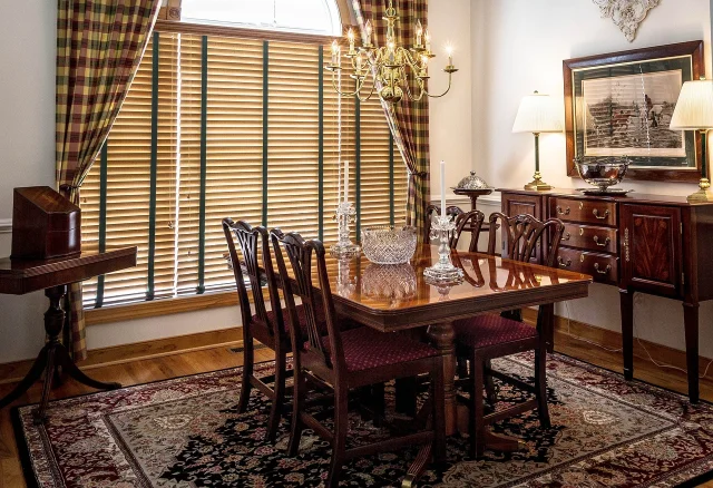
Classy and Traditional: Timeless Color Pairings

In the realm of interior design, certain color combinations stand the test of time, exuding elegance and a sense of tradition. Cameo pink, UCLA blue, and granite gray form a trio that speaks to a sophisticated yet lively aesthetic. This palette is reminiscent of the classic attire of affluent, preppy college students, but its appeal extends far beyond campus borders.
For a space that aims to be both reserved and inviting, consider blending skin tones with imperial blue and ruby. This mix achieves a balance between sophistication and warmth, making it ideal for living areas where comfort meets style.
When selecting blinds to complement these timeless wall colors, aim for subtlety and refinement. A list of suggested materials and colors includes:
- Linen blinds in cameo pink
- Wooden shutters in deep blue
- Roman shades in a soft gray
By carefully choosing blinds that harmonize with these classic color schemes, you create an atmosphere of enduring grace and poise.
Modern and Bold: Saturated Colors and Flat Design
In the realm of modern interior design, boldness is key. Saturated colors paired with flat design create a dynamic visual impact that is both contemporary and eye-catching. Flat design colors are known for their brightness and high saturation, making them ideal for a statement look.
- Vivid yellow, blue, and pink can be combined for a lively yet professional atmosphere.
- For a sleek and futuristic appeal, blend blue sapphire, gunmetal gray, and platinum with warm peach-orange and tan.
- A minimalist approach with a dark smoky black background and electric blue accents offers a striking and simple aesthetic.
Embrace the audacity of saturated colors to transform a space into a vibrant and energetic environment. The absence of shadows and textures in flat design emphasizes the purity of the colors, making each hue stand out distinctly.
When selecting blinds for such a palette, consider solid-colored options that can hold their own against the powerful wall colors. The right blinds will not only complement the walls but also enhance the overall design narrative of the room.
The Impact of Light and Space on Color Choices

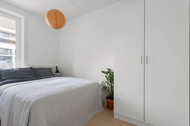
Image by Markéta Klimešová from Pixabay
Maximizing Small Spaces with Color and Blinds
In small living spaces, the right combination of blinds and wall colors can create an illusion of a larger room. Choose lighter shades for walls to reflect more light and make the space feel open and airy. Blinds should be sleek and not too bulky, allowing for a clean look that doesn’t overwhelm the room.
Texture plays a significant role in small spaces. Bamboo shades, for instance, add depth without taking up extra space. They are thin when pulled down, maximizing the room’s perceived size. Here’s how to enhance a small space with blinds:
- Select blinds that are the same color as the walls to extend the visual plane.
- Opt for blinds with a minimalistic design to avoid visual clutter.
- Use blinds that can be rolled up neatly, ensuring maximum natural light when desired.
By carefully selecting blinds and wall colors, you can transform a cramped area into a welcoming and seemingly more spacious environment.
Remember, the goal is to create a cohesive and expansive feel. Blinds are not just for privacy and light control; they are an integral part of the room’s design, contributing to the overall aesthetic and spatial perception.
10 Feng Shui Bedroom Tips for a Harmonious and Balanced Space
Creating a Cohesive Look in Open Plan Areas
Open-plan living spaces are designed for functionality and sociability, but without careful planning, they can become overwhelming. Furniture placement and area rugs are essential in defining different zones without the need for walls. A symmetrical layout can bring order to square rooms, while varied focal points can enhance longer spaces.
- Use area rugs to define zones
- Position furniture to encourage conversation
- Maintain consistent lighting and materials
In open-plan areas, it’s crucial to maintain a sense of unity while allowing each function its own space.
Choosing the right blinds can play a pivotal role in this harmony. Opt for styles that complement the overall design theme, such as Roman shades or bamboo rollers, to add texture and warmth. The key is to select window treatments that tie the different areas together, creating a seamless flow from one space to another.
Selecting Blinds for Well-lit Versus Dim Rooms
The choice of blinds is crucial in rooms with varying light conditions. For well-lit spaces, Venetian blinds or those with horizontal slats offer excellent control, allowing you to adjust the amount of light and privacy with ease. In contrast, dim rooms can benefit from lighter materials that don’t block the precious light available.
- Well-lit Rooms: Venetian blinds, zebra blinds, or any with adjustable slats.
- Dim Rooms: Opt for lighter materials, possibly with a sheer quality.
The right blinds can transform a room from feeling cramped to appearing expansive. In well-lit areas, they add an element of control, while in dimmer spaces, they can enhance the available light.
Pricing for blinds varies based on size, material, and additional features like a blackout liner. It’s advisable to get a quote based on your specific needs to ensure the best fit for your space and budget.
Exploring Material and Color Samples

The Importance of Sampling Before You Decide
Sampling is a critical step in the design process. It allows you to experience the materials and colors in your own space, under your lighting conditions. This hands-on approach is essential for making an informed decision.
- Visual Reference: Samples provide a tangible point of comparison.
- Tactile Experience: Feeling the texture can influence your choice.
- Color Accuracy: Monitor displays can be deceptive; real samples reveal true hues.
Sampling mitigates the risk of disappointment and ensures that the final selection harmonizes with your interior design vision.
Deciding on the right blinds involves more than just aesthetics. It’s about how they will live in your space. The texture, weight, and light filtration all contribute to the ambiance of a room. Without sampling, you’re only guessing.
How Different Materials Affect Color Perception
The interplay between material and color is a subtle yet powerful element in interior design. Different materials can significantly alter the perception of a color, with each texture and finish bringing its own unique influence. For instance, a glossy finish can make colors appear more vibrant, while a matte finish might render them more subdued.
Texture also plays a crucial role in how we perceive color. A rough texture can diffuse light, softening the color, whereas a smooth surface can reflect light, intensifying the hue. Consider the following examples of how material affects color in blinds:
- Bamboo shades offer a natural and varied texture that can warm up or soften the colors they display.
- Metallic finishes in blinds can add a sleek and modern touch, often making colors appear cooler and more refined.
The choice of material should align with the desired mood and style of the room, as it can enhance or mute the visual impact of your color scheme.
When selecting blinds, it’s essential to understand that the material’s texture and finish will interact with the room’s lighting and other design elements to create a unique ambiance. This is particularly true for bamboo shades, which come in a wide array of textures and colors, each capable of transforming the space in its own way.
Bamboo shades offer a unique blend of natural beauty and practical functionality. Choosing the right bamboo shade is crucial, as the variety in texture and color can be overwhelming. Here’s how to navigate the options:
- Consider the room’s existing decor to ensure the bamboo shades complement the interior.
- Pay attention to the feel and texture, which add depth and interest to your space.
- Quality is non-negotiable; higher quality shades last longer and look better.
When selecting bamboo shades, it’s not just about aesthetics; it’s about finding the right balance between beauty and durability.
Remember, the right bamboo shade can be the perfect finishing touch to your room, enhancing the overall design while providing the desired level of privacy and light control.
Final Touches: Complementing Furniture and Fixtures
Matching Blinds with Key Furniture Pieces
When selecting blinds, consider how they will harmonize with key furniture pieces. Choose blinds that complement, not match, the tones and textures of your furniture. This approach adds depth and character to your room.
For a cohesive look, align the blinds with the dominant furniture color. Use valances to introduce a complementary material or color, enhancing the overall aesthetic. Here’s a simple guide to pairing blinds with furniture:
- Sofa: Opt for blinds in a similar tone to create a seamless backdrop.
- Coffee Table: Select blinds that contrast with the table to draw attention.
- Bookshelf/Cabinetry: Choose a shade that bridges the furniture and wall color.
In spaces where furniture serves as a focal point, let the blinds play a supporting role, subtly tying the room together without overpowering the key elements.
Choosing Blinds That Complement Flooring and Cabinetry
When selecting blinds, aim for a harmonious relationship with your flooring and cabinetry. Choose tones that complement rather than match to avoid a monotonous look. For instance, with dark wood floors, consider lighter shades of blinds to create a balanced contrast.
Texture plays a significant role in this pairing. Bamboo shades, with their natural texture, can add depth and interest, especially against smooth, glossy cabinetry or flooring. They serve as a visual bridge between different elements in a room.
- Consider the undertone of your wood elements.
- Select blinds that contrast in lightness or darkness.
- Use texture to add depth and balance.
The key is to create a cohesive look that feels intentional and well-thought-out, not just a random assortment of colors and materials.
Always get samples before making a final decision. The subtle nuances of color and texture in your blinds can significantly impact the overall aesthetic. Test them in your home’s lighting to ensure they truly complement your space.
The Finishing Touch: Blinds as a Design Element
Blinds are not just functional; they are an integral part of the room’s aesthetic. Choosing the right blinds can elevate a room from ordinary to extraordinary. The texture and material of the blinds add depth and character, complementing other design elements.
Feel and texture play a crucial role in the overall ambiance of a space. Bamboo shades, for instance, offer a natural and warm feel, enhancing the room’s coziness and appeal.
The right blinds serve as the final stroke in the canvas of your room, seamlessly integrating with the decor to create a harmonious and finished look.
Consider the following when selecting blinds as a design element:
- The color and texture should align with the room’s theme.
- The size and placement can alter the perception of window dimensions.
- Material choices reflect the room’s intended mood and functionality.
Conclusion
In the journey to create a harmonious and inviting living space, the interplay between blinds and wall color is a subtle yet powerful element. As we’ve explored, the right combination can enhance the aesthetic appeal and overall feel of a room. Whether you’re drawn to the natural textures and depth of bamboo shades or the clean simplicity of light-colored blinds, the key is to complement, not match, the surrounding decor.
Remember to consider the size and function of the space, the mood you wish to evoke, and the existing color palette. By keeping in mind the tips and insights shared in this article, you can confidently select blinds that will tie your room together beautifully. And don’t forget, experimenting with free samples can be an invaluable step in making the perfect choice for your home.
Frequently Asked Questions
How do I match blinds with my wall color?
Choose blinds in a complementary tone to your wall color. Complementary tones are those that are opposite each other on the color wheel, providing a pleasing contrast. If you prefer a more subtle look, select blinds in a similar shade but different hue or lightness to add depth without overwhelming the space.
Should blinds match the floor or just complement it?
Blinds do not have to match the floor exactly; it’s often better to choose a complementary color that enhances the overall aesthetic of the room. Consider the tone and grain of your wood flooring and select blinds that harmonize with these elements.
Can texture play a role in selecting blinds?
Absolutely. The texture of blinds can add depth and interest to a room. For instance, bamboo shades offer a natural texture that can complement various decor styles and balance out other elements such as flooring and furniture.
How do I choose blinds for an open plan area?
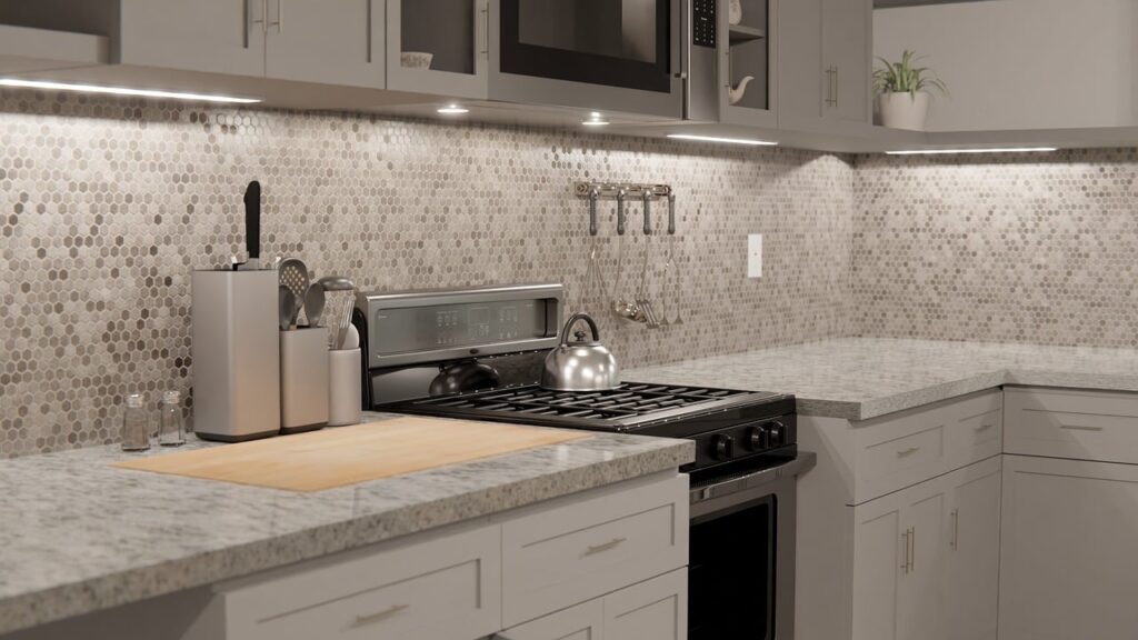
In an open plan area, aim for cohesion by selecting blinds that match or complement the dominant color scheme of the space. Use the blinds to tie together different zones, such as the living area and kitchen, for a unified look.
What’s the best way to test how blinds will look in my home?
Ordering samples is the best way to see how different blinds will look in your home. Many companies offer free samples, allowing you to compare materials, colors, and textures in the specific lighting conditions of your room before making a decision.
How do I choose blinds for a room with saturated wall colors?
For rooms with saturated wall colors, consider blinds in neutral tones to balance the intensity of the walls. Alternatively, you can choose a color from the same palette but in a lighter shade to maintain the bold aesthetic without overwhelming the space.